Substantive Post 1
Before this module, I mostly thought about multimedia in terms of what tools to use rather than how people actually learn from them. Reading about the theories of multimedia learning helped me slow down and think more intentionally about how information isn’t only delivered, but processed.
One concept that stood out was limited cognitive capacity, especially when paired with extraneous cognitive load. I think everyone has experienced information overload, such as a presentation with too much text or visuals competing for attention. I realised I have this problem with some textbooks or PDF documents, where I struggle to find what to focus on. Reducing extraneous load makes complete sense because unnecessary information distracts from the main message and makes learning harder than it needs to be. Less really is more.
What surprised me was learning about germane cognitive load and how it works alongside intrinsic and extraneous load. We need some mental effort to understand anything at all. Germane load represents the effort learners put into understanding and organising information. It isn’t about making everything as easy as possible, but about removing distractions so learners can spend their energy making meaning. At the same time, it’s about balance– content that is too simple can lose its message, while content that is too demanding can cause learners to shut down.
One real-world example that immediately came to mind while reading about these principles was Steve Jobs’ presentation style. His slides were known for being extremely simple, often just a black or white background with a single word or image. Being able to pinpoint the one key idea and cut everything else out isn’t easy to do- and it’s something I still struggle with. Jobs was able to identify the main message and let that idea lead instead of overwhelming the audience with pages of text. This approach aligns closely with the coherence principle and reducing extraneous cognitive load. Instead of reading paragraphs, the audience could focus on him and what he was saying, with each slide clearly communicating the core idea.

Thinking about my own projects, these theories are already shaping my design choices. I imagine my audience as both clients and their clients, which means I need to be mindful of who the content is for and what will resonate with them. For example, advertising a wrinkle cream requires visuals and messaging aimed at an older audience, not younger people. I plan to use colour coding more intentionally to help organise information and guide attention. The more challenging part will be segmenting information into clear, bite-sized pieces so learners don’t feel overwhelmed.
Looking back, I realise I’ve naturally used a dual coding approach by colour coding, labelling diagrams, and pairing visuals with text to support my memory. While fixed learning styles aren’t strongly supported, this approach works for me personally and highlights the value of dual coding in my design choices. However, I haven’t always been consistent about segmenting information or keeping text brief, which can increase extraneous load. Moving forward, I want to move closer to Steve Jobs’ approach by being more intentional about clarity and simplicity, making sure design choices support learning rather than distract from it. Overall, these theories have pushed me to think less about adding content and more about designing with an audience in mind.
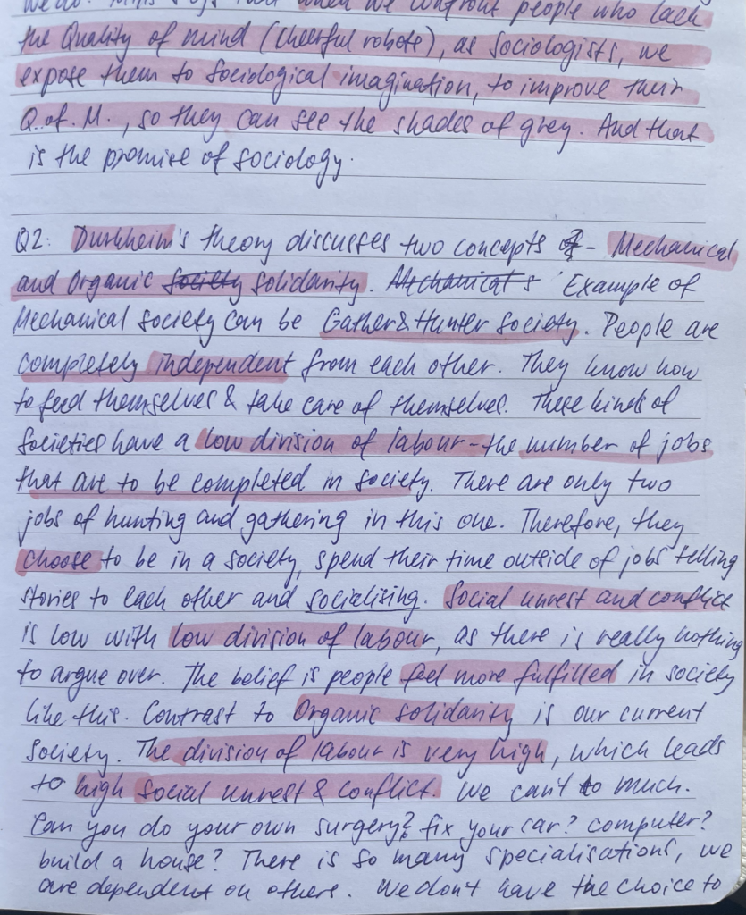
I included some of my notes as an example of the principles:

These notes show how I naturally use sketches alongside text to organise ideas and reduce cognitive overload while learning.
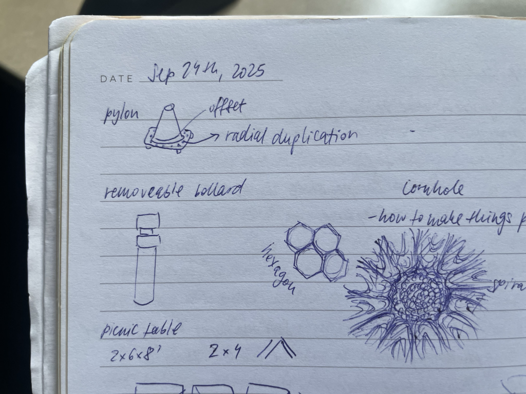
Doodling helps me think through ideas visually, turning mental effort into understanding rather than overwhelm.
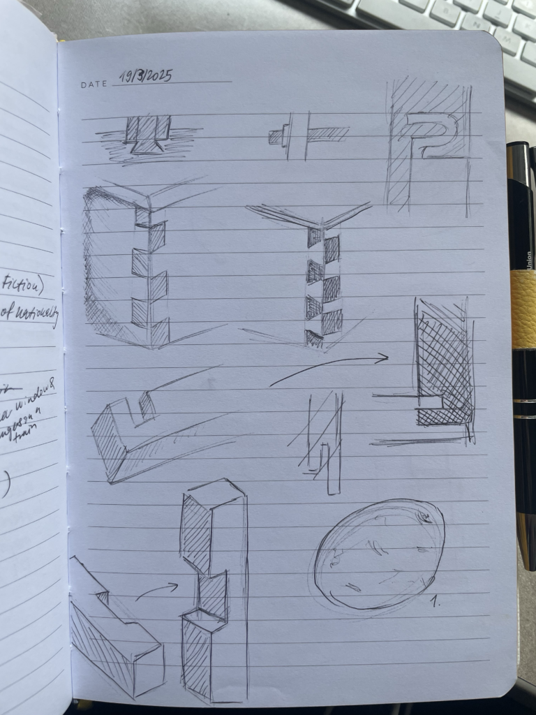
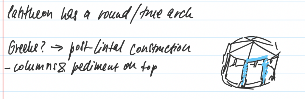
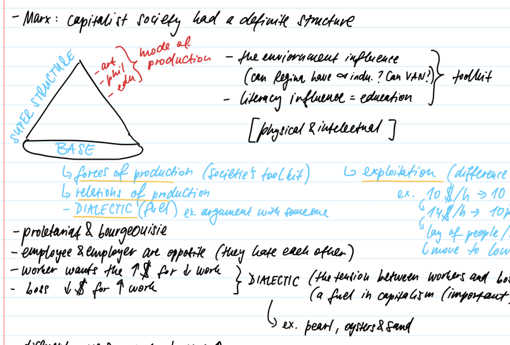
Using arrows, boxes, and spacing helps signal what matters most and keeps my attention focused.
Leave a Reply
You must be logged in to post a comment.